Motivation: while building and maintaining a Product-Qualified scoring system (see Part 1) for several years, I have learned a lot about its day-to-day use across many teams. These are some thoughts on where to take the basic PQL model, what questions to ask, and where it can deliver impact across a SaaS business. At a future point I’ll put together a Part 3: what PQL can’t tell you and where it breaks when bent too far.
Questions in this post:
What is in the score? Which parts of the product have the highest sufficiency for indicating conversion?
How are active accounts (open trials, freemium) performing? Which ones show high likelihood of conversion?
How are the active accounts obtaining their score? Both, which areas of the product are delivering across the board, and what are individual accounts doing to score higher?
Understanding the Score
Visualizing all of the user actions that go into the score in terms of their predictive importance can be a very helpful way to breakdown the model and communicate its function with other teams. Plotting each action in a 2D field where Necessity and Sufficiency form the axis gives a view of the relative predictive value of each observable element. I used a dashboarding tool to make an interactive chart that allows filtering by product area, and selecting individual bubbles to see metric details.
As described in Part 1, required actions are at the bottom (fully necessary), and the bubbles rise up as they become less necessary. I have labeled the vertical axis “Required <> Predictive” to translate this concept. Sufficiency forms the horizontal axis (“Path to Buying”), with insufficient actions on the left side and moving right as sufficiency increases. The dense cluster in the lower left are the least predictive (necessary but not sufficiency), while the bubbles in the upper right are most predictive (not necessary but sufficient). Pointing the non-technical teammate to these quadrants and providing a “hands on” method to explore the product areas has proven very helpful in building trust in the model.
Actions that make up a PQL score plotted against Necessity and Sufficiency.
Bubbles: what to do with size? In this case I decided to use the size of each action-bubble to indicate confidence (based on data volume). Actions that are almost never done and we have very little data on are small, while actions that are done by nearly every account are the largest. As new features are released we can see in the bubble size how reliable they are, and move the discussion towards decision making and away from interrogating the model.
Understanding Accounts
How do accounts gain their score?
Actions for each account grouped by degree of predictive value.
Rolling up lots of actions to a single score can enable automations and sales efficiencies, but not all scores are created equal. Is an account doing a low-score action many times, or a high-score action once? To catch this notion broadly, I broke the actions down into 5 color-bands according to their predictive value (black=required/necessary, yellow=predictive/sufficient) for plotting purposes, and then charted the incremental score amounts for each active account. The resulting bars (one for each account) provide an at-a-glance look at what accounts are doing, in terms of “activation.” (in this case I found it interesting that a few lower scored accounts had significant amounts of orange, while a few higher scored accounts had very little orange/yellow.)
While there are clear patterns in the ratios between color sections in each account, there are a few interesting variants where some lower scored accounts have disproportionate amounts of orange, and a few higher scored accounts have very little orange/yellow. This leads to our next opportunity for analysis: what are those out of sequence accounts (with more orange/purple than the neighboring bars) doing in the product?
My model has grown to include over 500 observable product actions (from logging in to starting a Support chat to joining a video call), and attempting to read an event log transcript for an account is too opaque to quickly assess what an account is doing. Using the PQL scoring model we can break down each active account and each element that gives them some amount of score, and sum these up according to product-area (as determined by our team: Home, Documents, etc.) In addition to a dashboard to plot these amounts for each account, this now allows us to translate the visual into a quick textual description of the score.
How did they do it?
Each account performs a unique set of actions that accumulate to give us Engagement and Activation metrics.
Signals: once we can see the primary areas accounts are activating in, we can setup a little algorithm to write out a human-readable summary of what each account did (this idea was inspired by the great products from MadKudu.com. I created an action statement for each product area, then took the most important lines to create a text snippet that could be seen at a glance on each account’s CRM record. For example:
Added 4 new users.
1 New user logged in.
Visited for 8 sessions.
Scheduled 3 Meetings.
Uploaded 4 Documents.
Created 1 Agenda.
Understanding Product
How is each area of the product performing in producing PQL value?
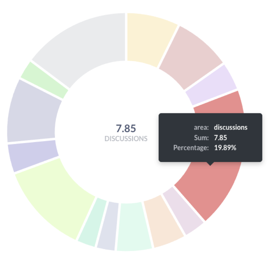
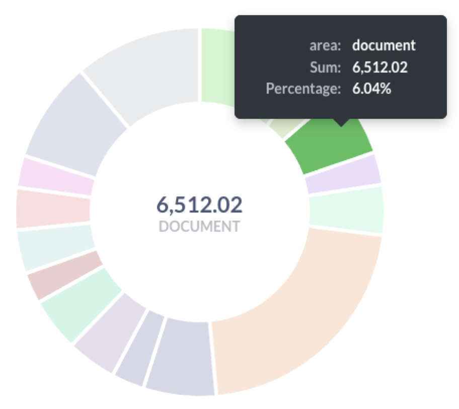
In addition to slicing active account scores by PQL elements, we can also look at the product overall and ask: which areas of the product are most effective in “activating” users? I have found that some areas of the product at Boardable, while showing as highly valuable in predicting conversion (high sufficiency, low necessity) are done very infrequently and very few accounts get that far into the product. At the same time, across the breadth of less predictive elements some are performed far more often than others. By breaking down any set of scores (I like to take 30 day cohorts at a time) in total by product area, we can see how the parts of the product are performing in delivering Product-Qualification value. I find this especially useful to inform new product development discussions, as well as providing insight into the impact of new releases and feature updates.
How is the product doing?
Each area of the product provides different amounts of predictive value, and may indicate opportunities for product tours and targeted messaging to prospects.
Impacts
Sales: given the underlying premise of predicting conversion the PQL score is clearly indicated as a tool for Sales. It has proven powerful at Boardable both in the hands of people working to close deals, and to drive behavioral-based automation. Accounts that are not showing “activation” can be sent more general nurture material, while highly engaged accounts are better targets for specific product messaging. By breaking down what individual accounts have done, product “walkthroughs” can be crafted and delivered to steer these activated users into finding increased value.
Support: as a tool to give a broad-strokes picture of how engaged an account is, the PQL score can be useful to include on account records used by support personnel. Is this person asking this question with a very low PQL score, indicating they are a very light user? Or is this highly scored person asking with a lot of product knowledge, because the 30th document they uploaded hit a bug? This little bit of insight can give your team more of the user’s background when picking up a support ticket (see: PQL Signals, above).
Going past conversion: while the model is built on pre-conversion correlations, it continues to deliver insight into account health post-conversion. Every user is on an onboarding journey with your product, and some may develop extensive usage knowledge prior to buying while others buy in anticipation of learning to use it. In B2B SaaS often a couple users will make the acquisition (“hire” the product) but then have a cohort of teammates that onboard later, at their own individual speeds. The areas of the product identified by our PQL model at Boardable align very closely with our onboarding milestones and “account health” scores, post-conversion. For example: uploading their first document is a key indicator of Product-Qualification and a significant initial milestone on the onboarding path.
PQL scoring has proven to be a great tool, but it also has many limitations and there are many things it cannot tell us (or leads to assumptions that may not be true). In Part 3 (tbd) I’ll share my thoughts and experiences on the dangers of trying to use this particular hammer on things that turn out not to be nails!
Dr. Ben Smith is a Data Scientist and thinker, fascinated by the appearance of computers in our daily lives, creativity, and human struggles. He has had the privilege to think, learn, and write at the University of Illinois, the National Center for Supercomputing Applications, the Cleveland Institute of Art, Case Western Reserve U., IUPUI, and at Boardable: Board Management Software, Inc.
If you have feedback or questions please use Contact me to get in touch. I welcome thoughtful responses and constructive critique.


